


Behind the Scenes of Book Cover Design
An Inside Look at the Creative Journey


Curious how a book cover comes to life?
Step behind the scenes of Ian Patterson’s cover design — from first ideas to final touches. This quick peek will show just how much time, thought, and care go into crafting a professional book cover. So come along… I’ll keep it brief and let the visuals do most of the talking.
Let me start by introducing you to the book — that’s really where it all begins.
I connect with the story and the author by having them answer a questionnaire of about 28 questions. This helps me understand the book’s main themes, the author’s vision for the cover, key characters, target audience, and more…
Transference, Book One of The Narrator Cycle, by Ian Patterson
Genre: Dystopian Science Fiction
Book blurb: Nicholas Fiveboroughs is a Sicko, someone that takes on others' illnesses. In a city where diseases can be transferred, the rich buy longer lives without pain, and the poor get a short life of constant sickness. Maybe it was fate, or maybe someone is looking out for him, but after Nicholas barely survives his latest affliction, he gets the chance to try and change things. To finally stop the whole disease transfer network.
Tensions escalate as Nicholas infiltrates a higher society he doesn’t understand, and starts to fall for the very person he needs to manipulate to be successful. And between run-ins with a talking animal and genetically modified humans, the world around him just keeps getting stranger. Can Nicholas tear down the disease transfer architecture? And can he do it without losing his own humanity along the way?
…
And when I feel ready, I let the magic happen…
Initial sketches
Concept one:
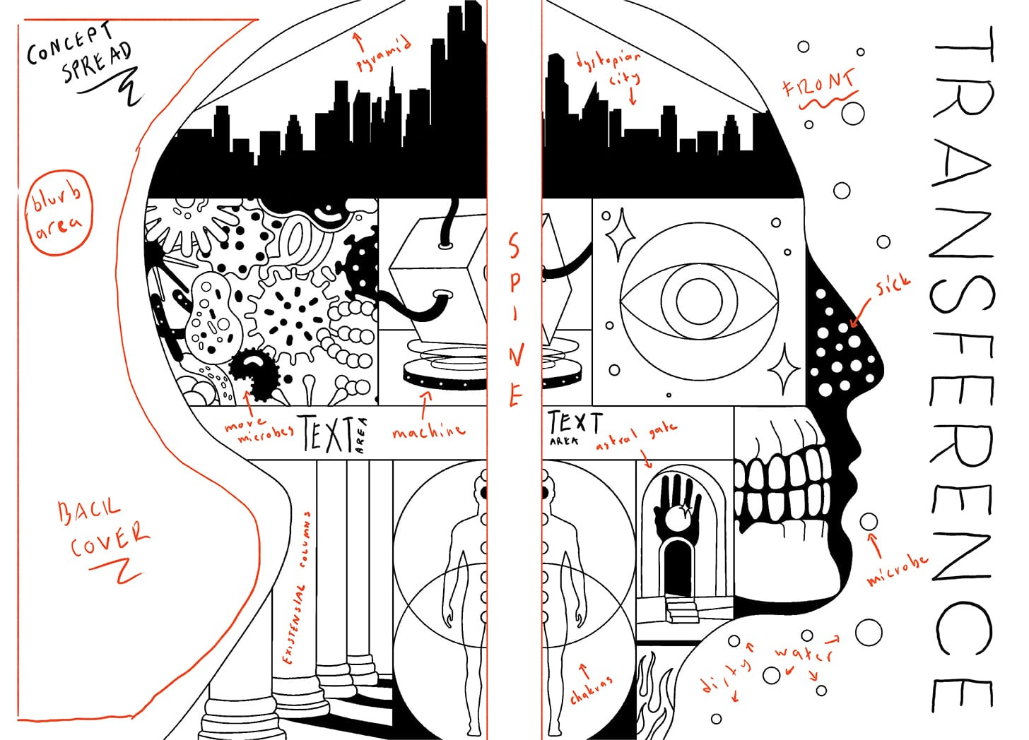
This concept captures the complex layers of the story — sickness and the human body, intertwined with mystic themes like astral/interdimensional travel. There are many symbolic elements in the design, with the watching eye representing the narrator’s presence and the idea of being observed. With a rich, magical realist style, this cover captures the speculative ideas that make this story unique within the dystopian and cyberpunk genres.
Concept two:
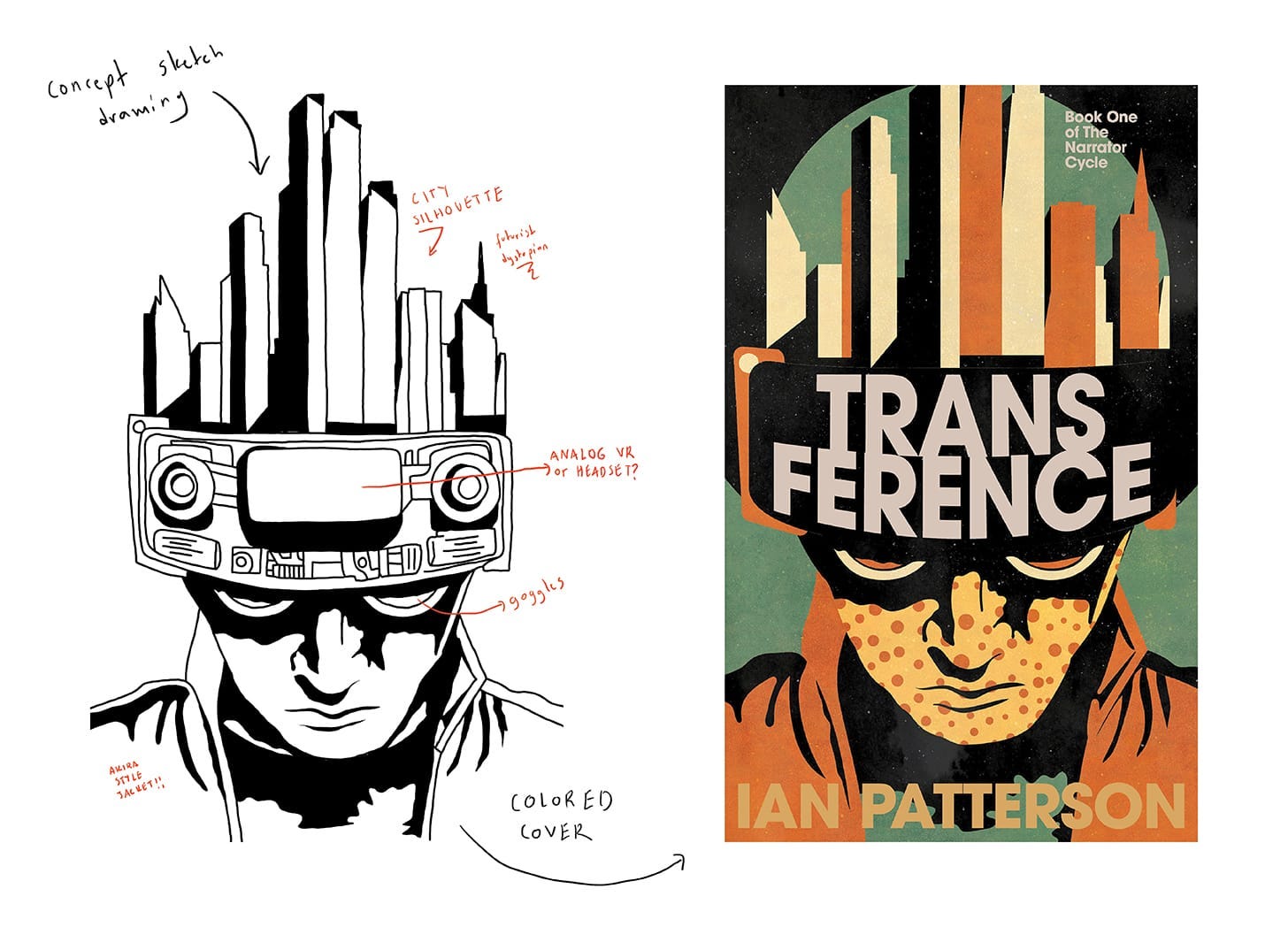
A dystopian concept, inspired by the 1984 style, depicting the protagonist struggling with sickness, wearing goggles and a helmet-like device that also resembles a fishbowl city. This cover merges key themes of the hero’s journey, illness, dystopia, advanced technology, and revolution.
And the winner is
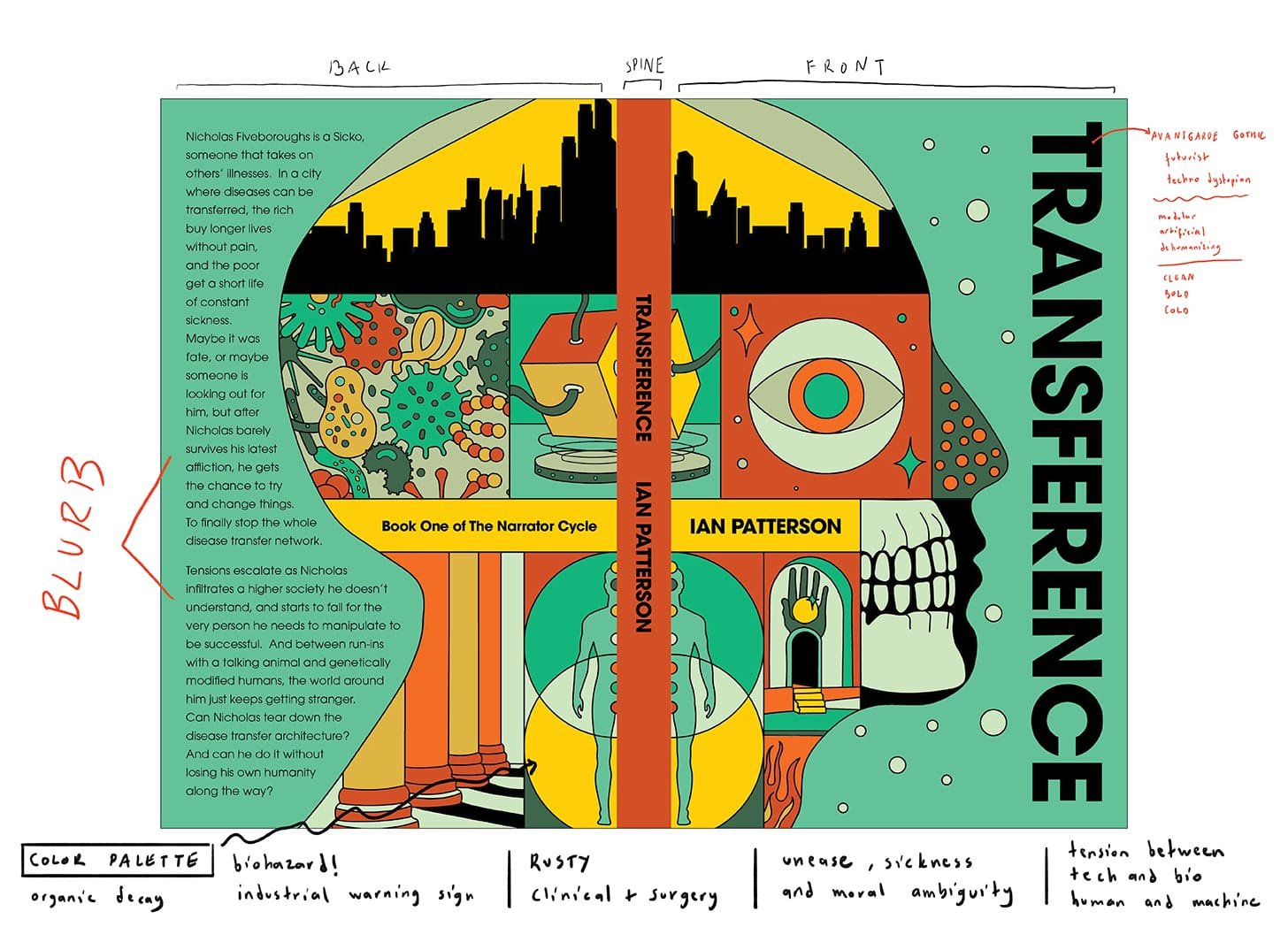
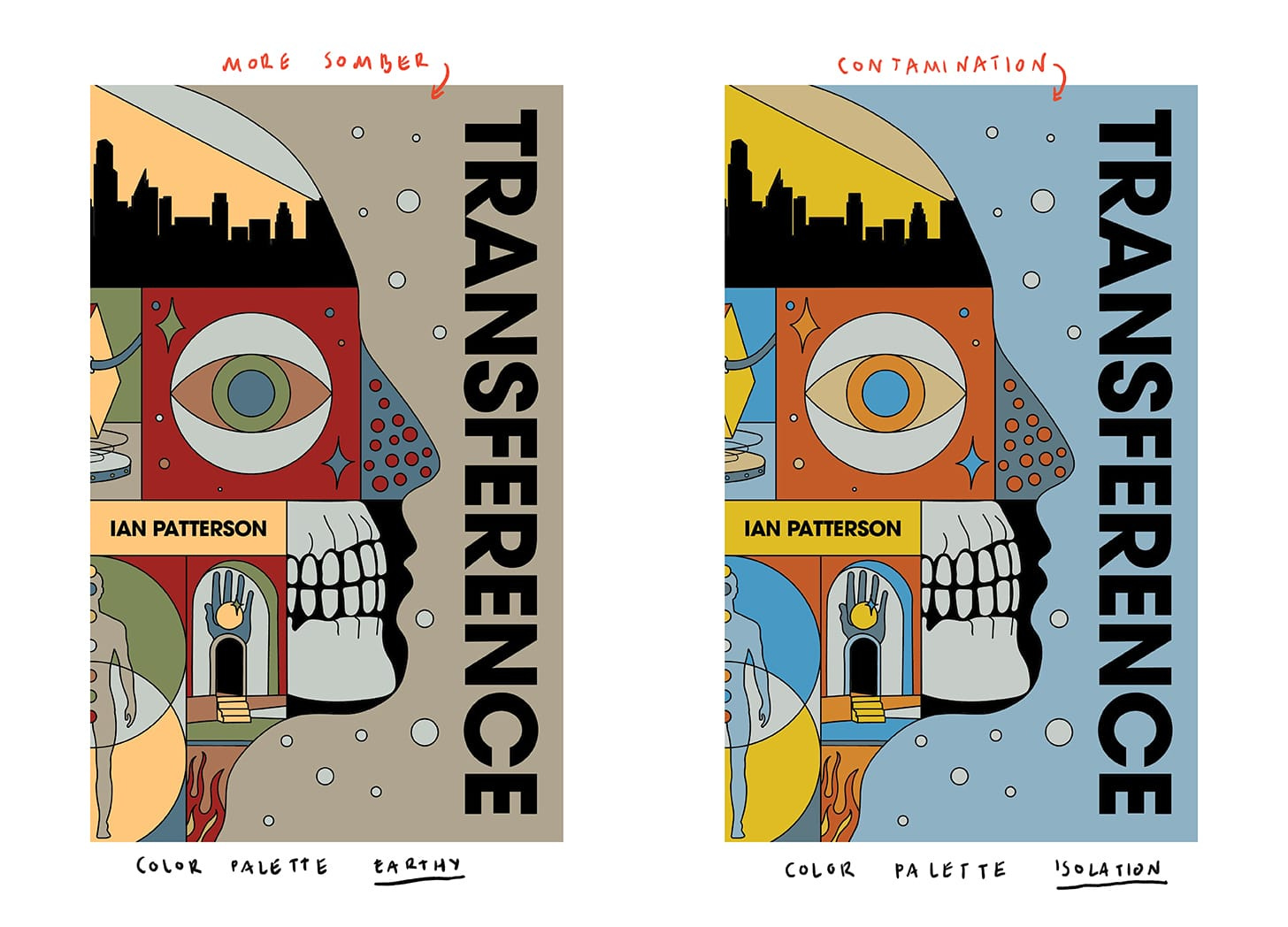
Presented in different color variations
We usually go through a round of revisions, but in this case, none were needed.


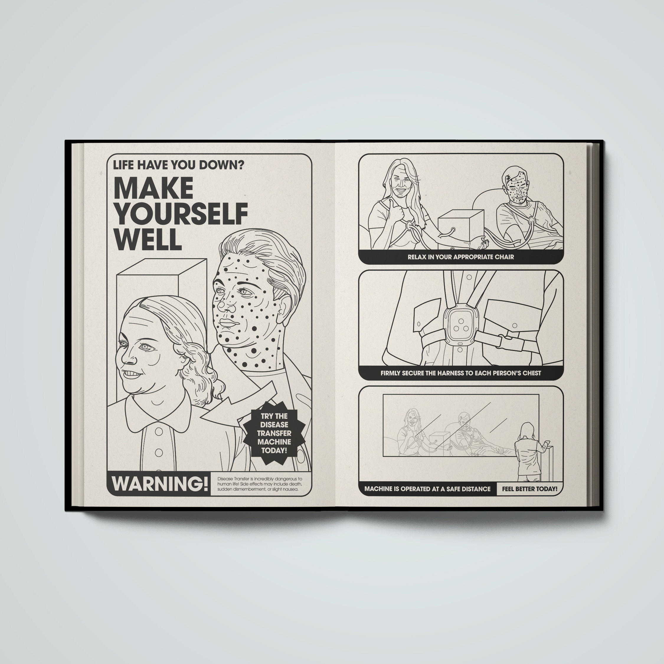
However, we decided to take it a step further and create an interior illustration to give readers a deeper look into Ian’s dystopian universe. Take a look!
You can find Ian’s book here
And here’s his review after the process was complete.
“I loved working with Barış. He's a consummate artist that knows what works, and what probably won't, and he helped me navigate creating an incredible cover and illustrations for my first novel. I am SO EXCITED at how the end product turned out, and I can't wait to show it off. It really elevates my book! I also really appreciated how much time he spent to understand my book, and what I like aesthetically, to come up with something that truly fits. I'll definitely be coming back to him for the sequel! His pricing was very fair, his timing was great, and he was communicative on progress. Thanks for all the hard work, Barış.”
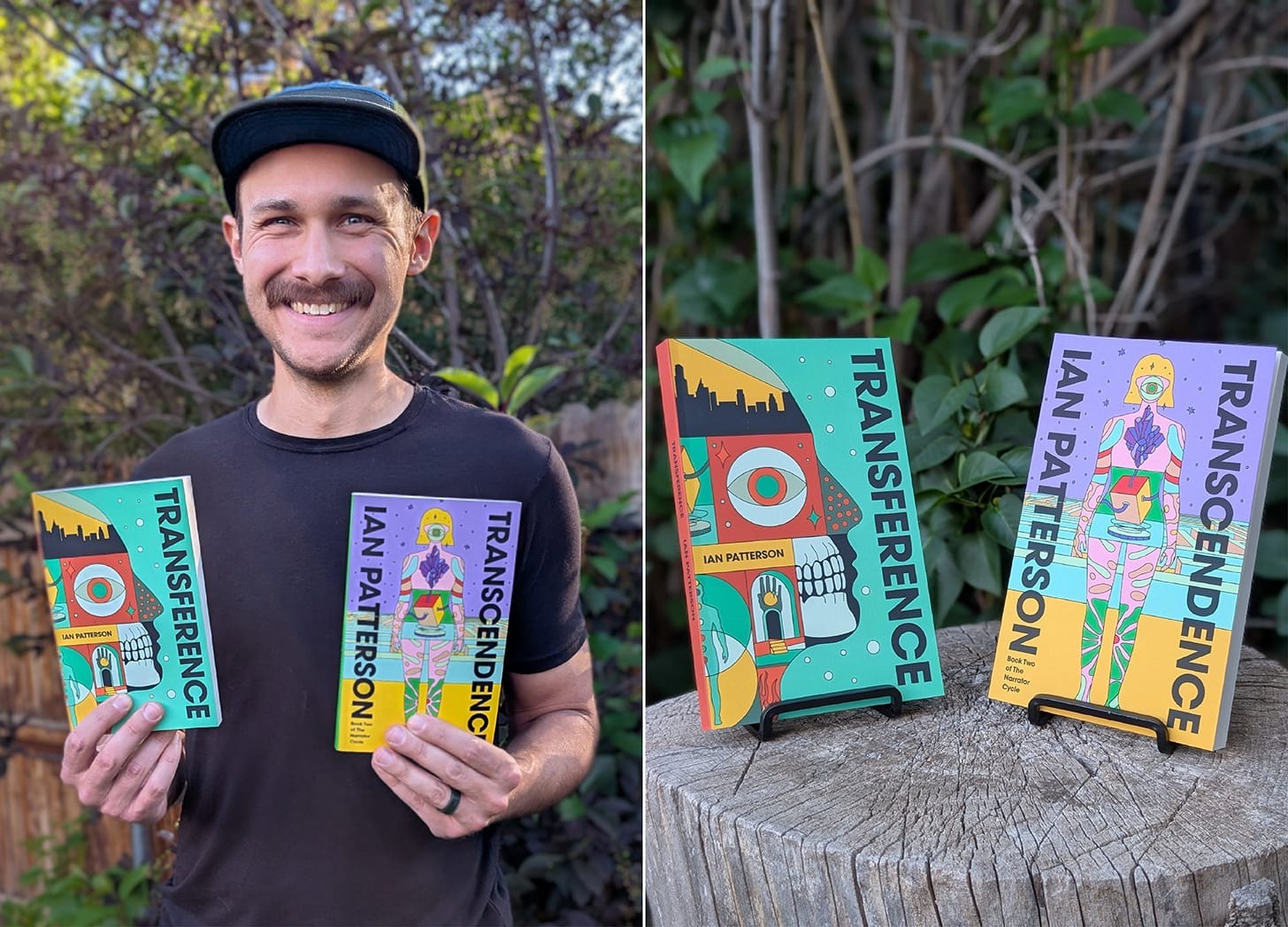
It was a real pleasure working with Ian, and I’m glad we had the chance to create the cover for his second book as well. If you’re interested, I’ll share the process behind it soon. For now, here’s a little sneak peek.
*I always love seeing authors smile while holding their books—it’s the best part!
 | A guest post by
|
Phenomenal
both of these designs are good, but i am in love with the one that didn't make it. you seem very good at this! thanks for showing the process, that's pretty cool.