


Behind the Scenes of Book Cover Design: Designing Book Cover Series
Exploring the creative process and challenges of designing a book sequel worthy of the original's magic.


When it’s time to release a sequel, a lot of authors start to worry about keeping things visually consistent.
The big challenge?
A sequel cover isn’t just about looking good—it needs to feel like it belongs with the original. It should match the tone, style, and branding, but also bring something fresh and have its own identity.
When authors come to me with these kinds of worries, I like to answer with visuals. So that’s exactly what I’m going to do here.
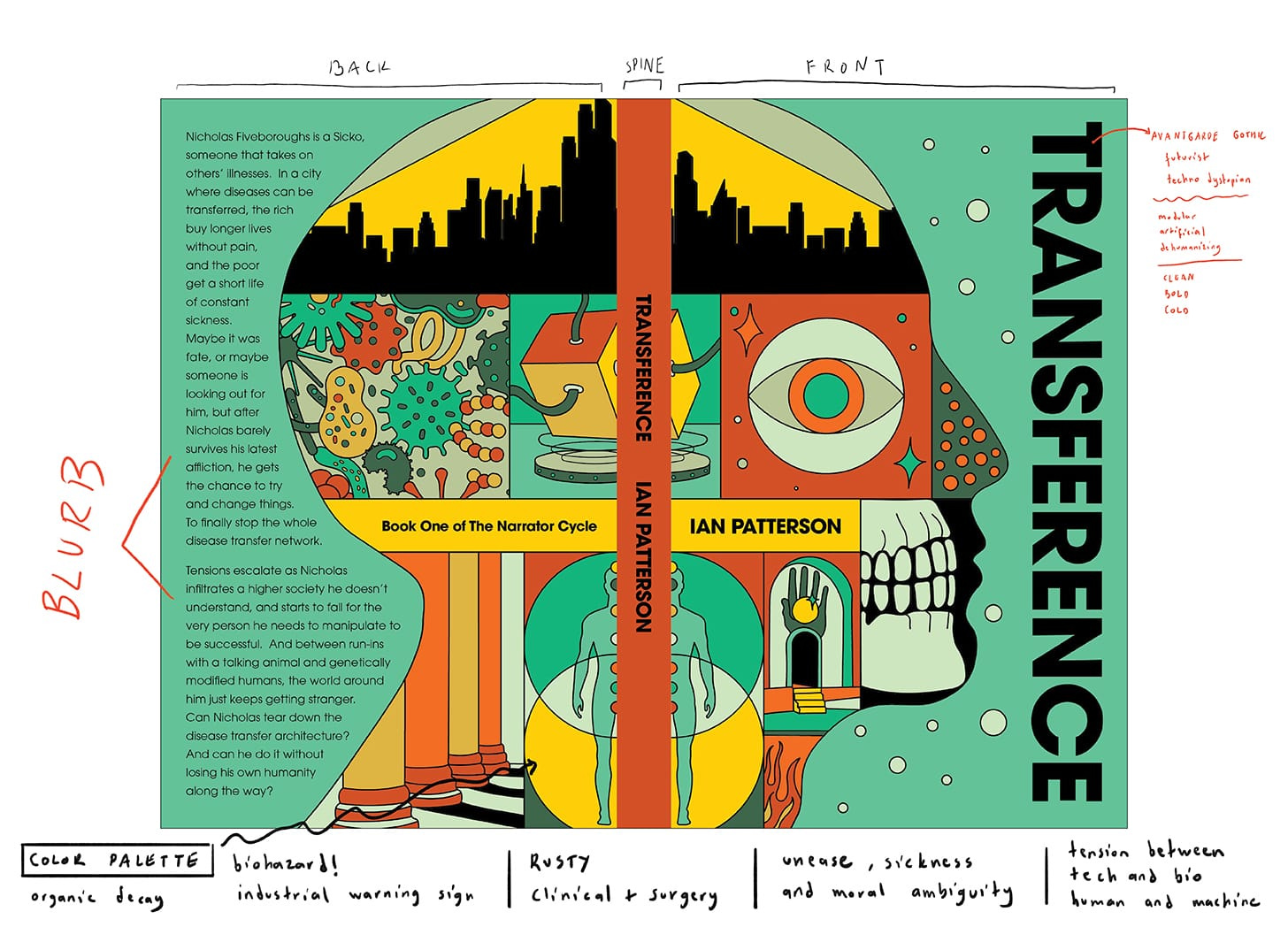
In the previous article, I explored the process of designing the cover for Ian Patterson’s book Transference. You can check it out here.
Now, let’s take a look at what happened with Ian’s second book.
Initial sketches
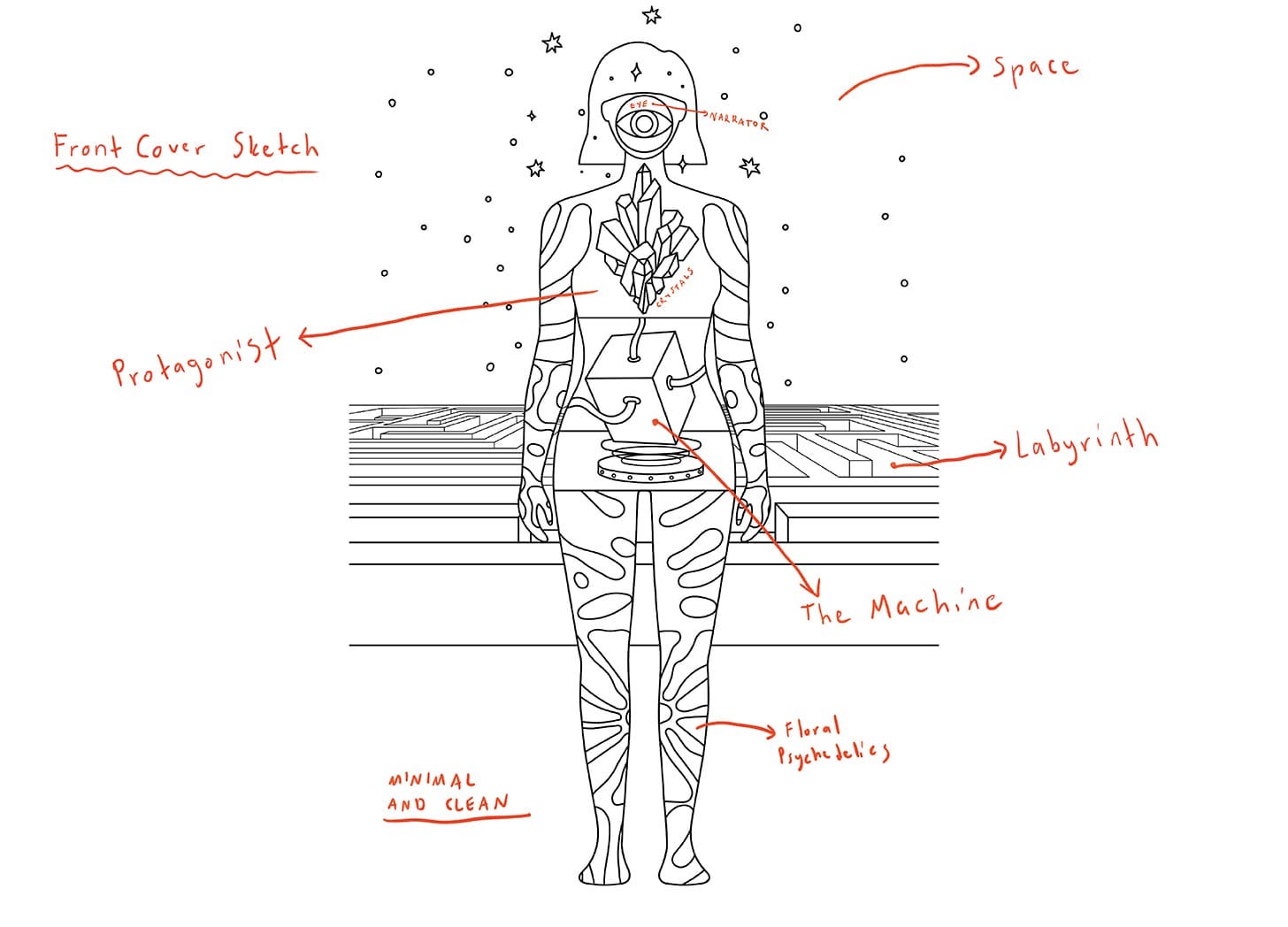
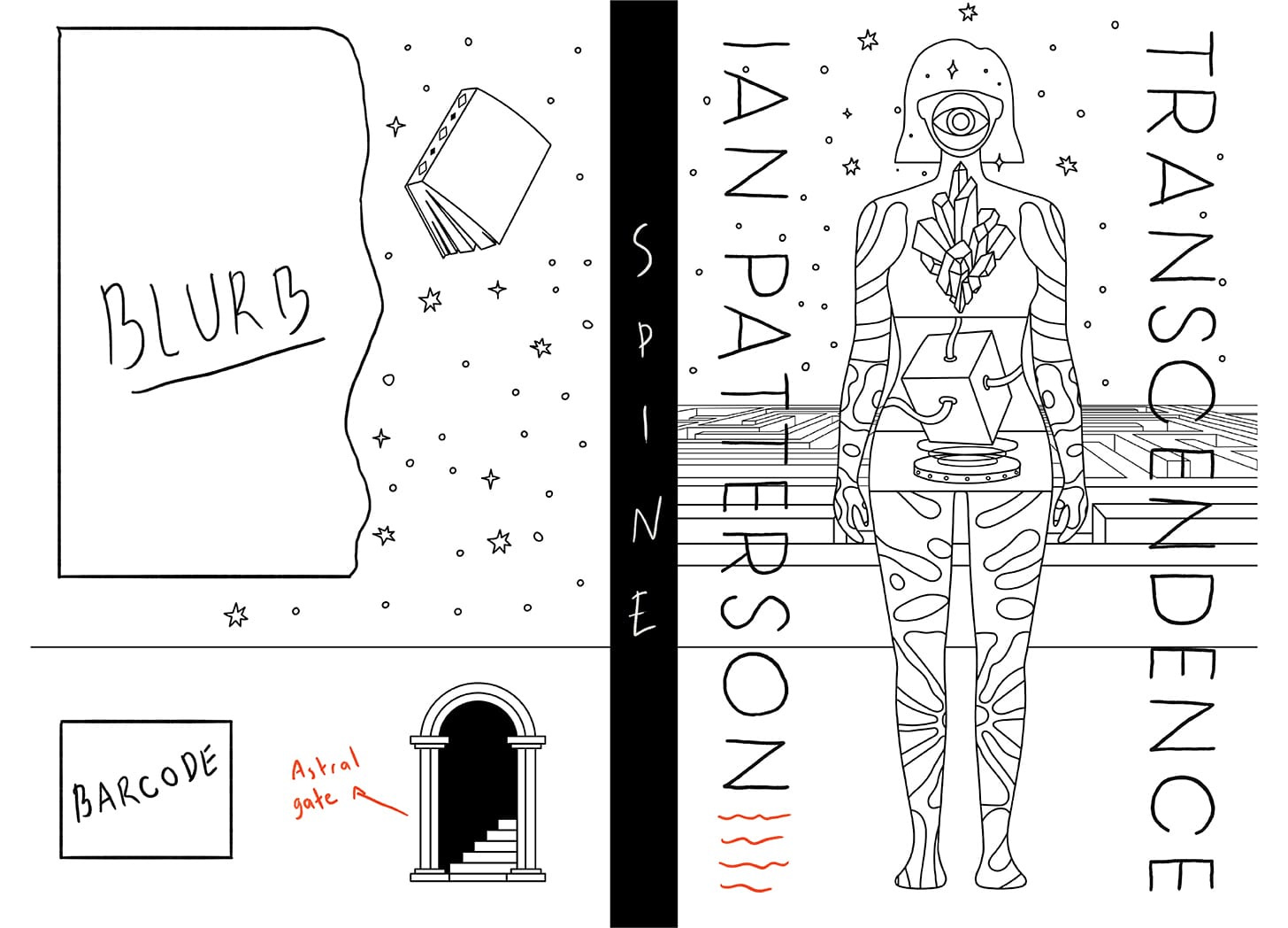
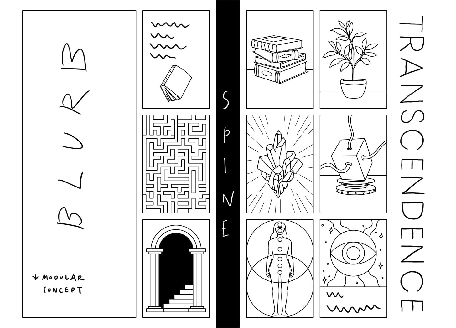
I hope the connection is clear by now.
And the winner is…
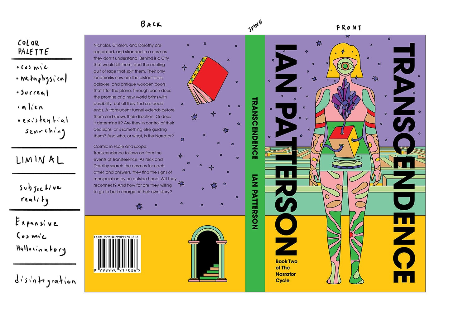


Offered in different color options, as usual.
…
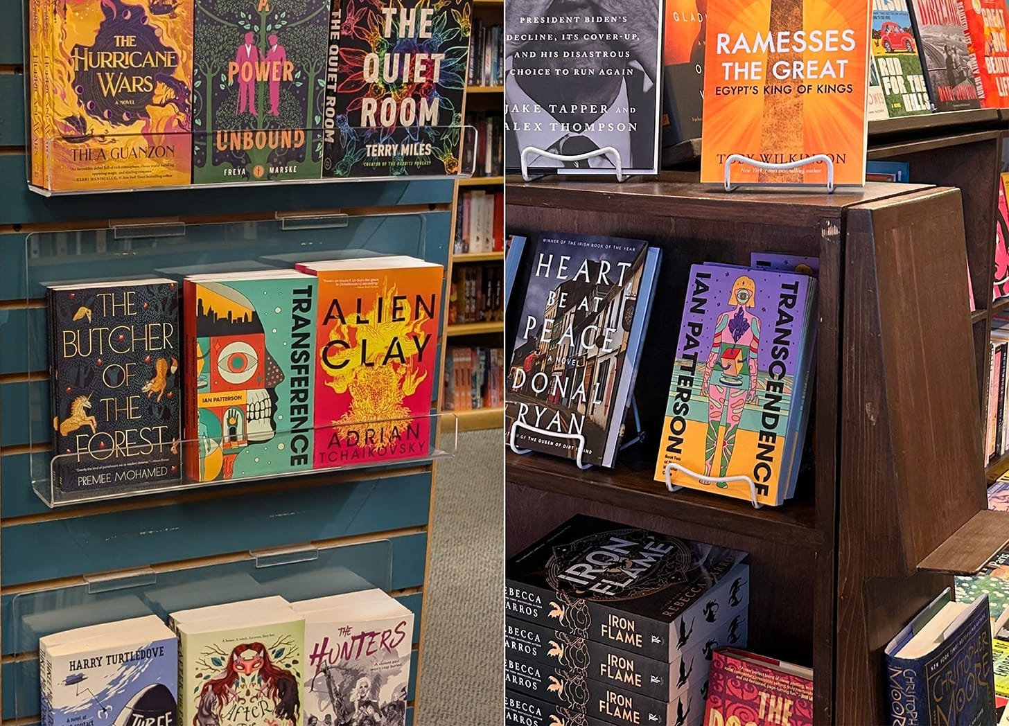
And look at these beauties right where they belong. Don’t they look great together?
More Cover Series to Explore
I’d also like to share more book cover series I’ve designed to show you how visual consistency works, how it’s created, and why, in the end, you as authors have nothing to worry about.


Thanks for sticking with me—I hope this helped!
 | A guest post by
|